The fact that you already have what has the makings of a signature style in mind is good. Now you have to tweak it to get a really saleable product.
Yes you have definitely achieved the softness you were looking for in the pieces. To maintain that, I would perhaps switch to watercolour pencils for all large sections and watercolour paper then, unless you are familiar with acetone blending. Just to take the edge off of the lines in the large areas.
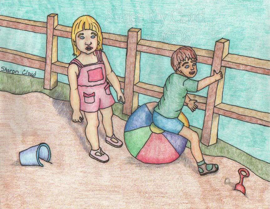
Of course this is merely one person's opinion, and what you do is totally up to you, but the thing that really throws me is the sketchyness of the bigger sections of colour. The shading is really lovely, but the technique does not have the "done on purpose" look to it because of that. If you want to keep it, I would suggest working on making it look like it does. In the world of illustration, you must perfect your technique. All styles, including simplistic or even "childish" can be done, but they must always look like they were intended to be that way.
ETA: Have you ever tried chalk pastels? A good quality set will have high pigment (and therefore good colour) and can be softened quite nicely with a dry brush and light hand.
Remember, illustration, like all advertising, is a very competetive and exacting field. It may take a lot of hard work, research, rejection, more work and more rejection on your part. One of the reasons I never bothered too much past the first few rejections-I just didn't feel like doing all that work and perfecting my techniques. I am notoriously lazy.

I do hope this doesn't sound too overbearing, just intended as a little constructive criticism, hopefully helpful. It drives me crazy when the only thing people can say about my work is "It's nice". AHHH kiss of DEATH! Anyway, eat the meat and spit out the bones.
Keep working at it!

[url=http://www.picturetrail.com/char000]CIP[/url] -slowly but steadily coming along... [img]http://www.planetsmilies.com/smilies/party/party0011.gif[/img]


 [/url]